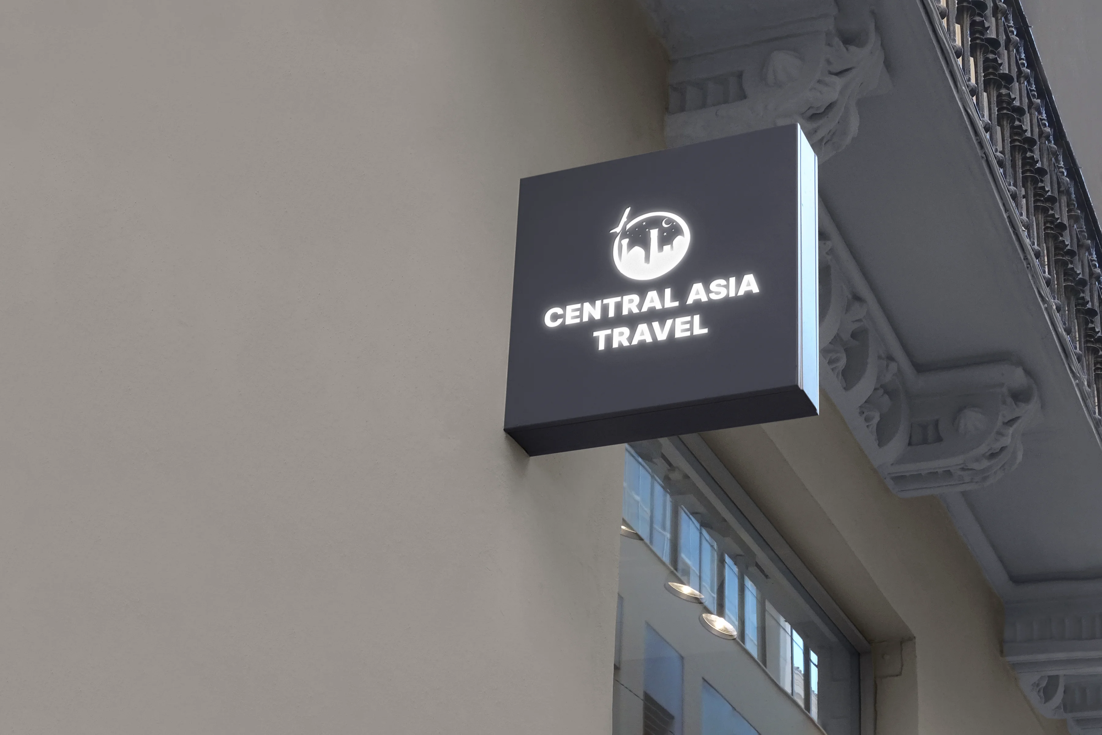
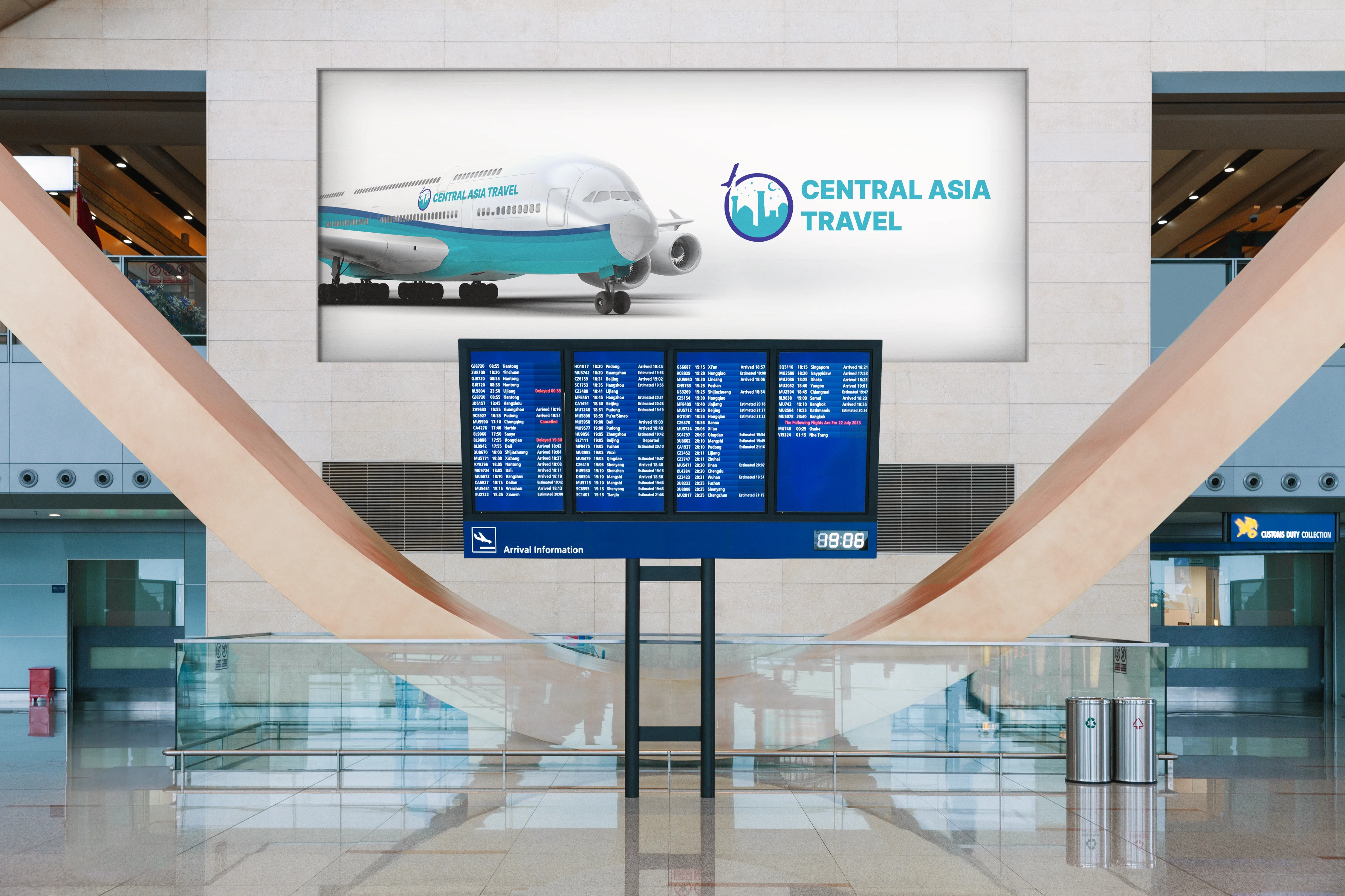
The logo for the travel agency Central Asia Travel, created by our marketing agency OKO, combined elements that reflect the beauty of Central Asia. The background of the logo was a pastel green shade, symbolizing the nature of the region. The central element of the logo was a stylized mountain, reminiscent of the region's mountain ranges. This composition conveyed the idea of adventure and travel. Below the mountain, waves were depicted, symbolizing rivers and streams of water, adding to the atmosphere of movement. At the center of the logo is a dome and minaret, symbolizing a landmark and a goal. The lines and shapes of the logo were harmonious, reflecting the stability and reliability of the company. This logo helped Central Asia Travel stand out from its competitors and attracted the attention of customers with its unique aesthetics and significance.


When creating a logo for the travel agency Central Asia Travel, we completed the following tasks:
These steps helped create a unique and memorable logo that helps the firm stand out in the tourism market and attract customers with its meaningful and aesthetic design.
Don’t postpone important decisions. Book a time in the calendar and let’s talk in person. We’ll help, advise, and find the right way forward.