OKO Logotype Preload

Call

Whatsapp

Telegram
Client

Home Bank Türkmenistan

Services

Branding
Identity

TOOLS

Adobe Ilustrator

01. ABOUT THE PROJECT

Marketing agency OKO created a logo for Home Bank that embodies its core values and customer focus. The logo included a symbol and text, harmoniously combined with each other. At the center of the logo was a stylized house, symbolizing the comfort and security that Home Bank provided to its customers. The smooth, streamlined lines of the symbol gave the logo a friendly and welcoming look. The color palette consisted of warm blues and soft greens, symbolizing trust and stability. The modern and easy-to-read font emphasized the openness and accessibility of the bank. The logo successfully conveyed Home Bank's commitment to being a trusted partner to its customers, providing them with a feeling of confidence and care. This logo created brand awareness and differentiated Home Bank from its competitors.

02. TASKS

When creating a logo for Home Bank in Turkmenistan, we faced the following challenges:

  1. Brand Research and Analysis: We conducted a detailed analysis to understand Home Bank's values, mission and target audience. This allowed us to highlight the key elements that should be reflected in the logo.
  2. Concept development: Based on the analysis, we created several logo concepts, each of which included different visual elements and symbolism, reflecting the core principles and goals of the bank.
  3. Sketching: We prepared a series of sketches and prototypes to visualize various ideas and select the most suitable concept for further development.
  4. Selection of color palette: We carefully selected the color scheme, taking into account the psychological impact of colors. The colors were meant to symbolize stability, trust and growth.
  5. Font Selection: We chose a font that combined modernity and elegance to ensure that the text portion of the logo was easy to read and reflected the professionalism of the bank.
  6. Creation of the final design: Once the concept and colors were approved, we created the final logo design, combining all elements into a harmonious and attractive visual image.
  7. Presentation and approval: We prepared a presentation in which we presented the final logo and explained the choice of each element. After discussion and feedback from the client, the logo was approved. 

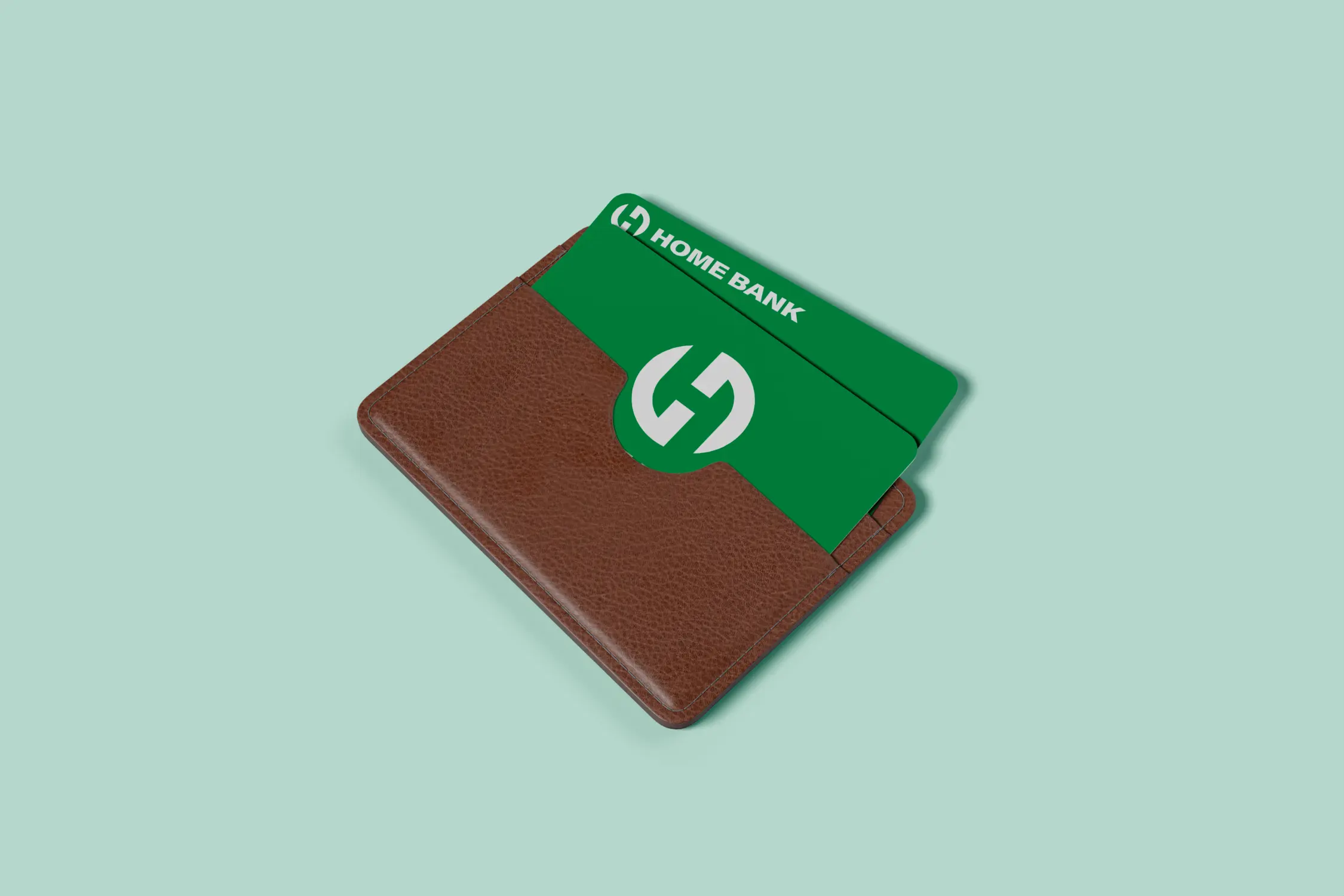
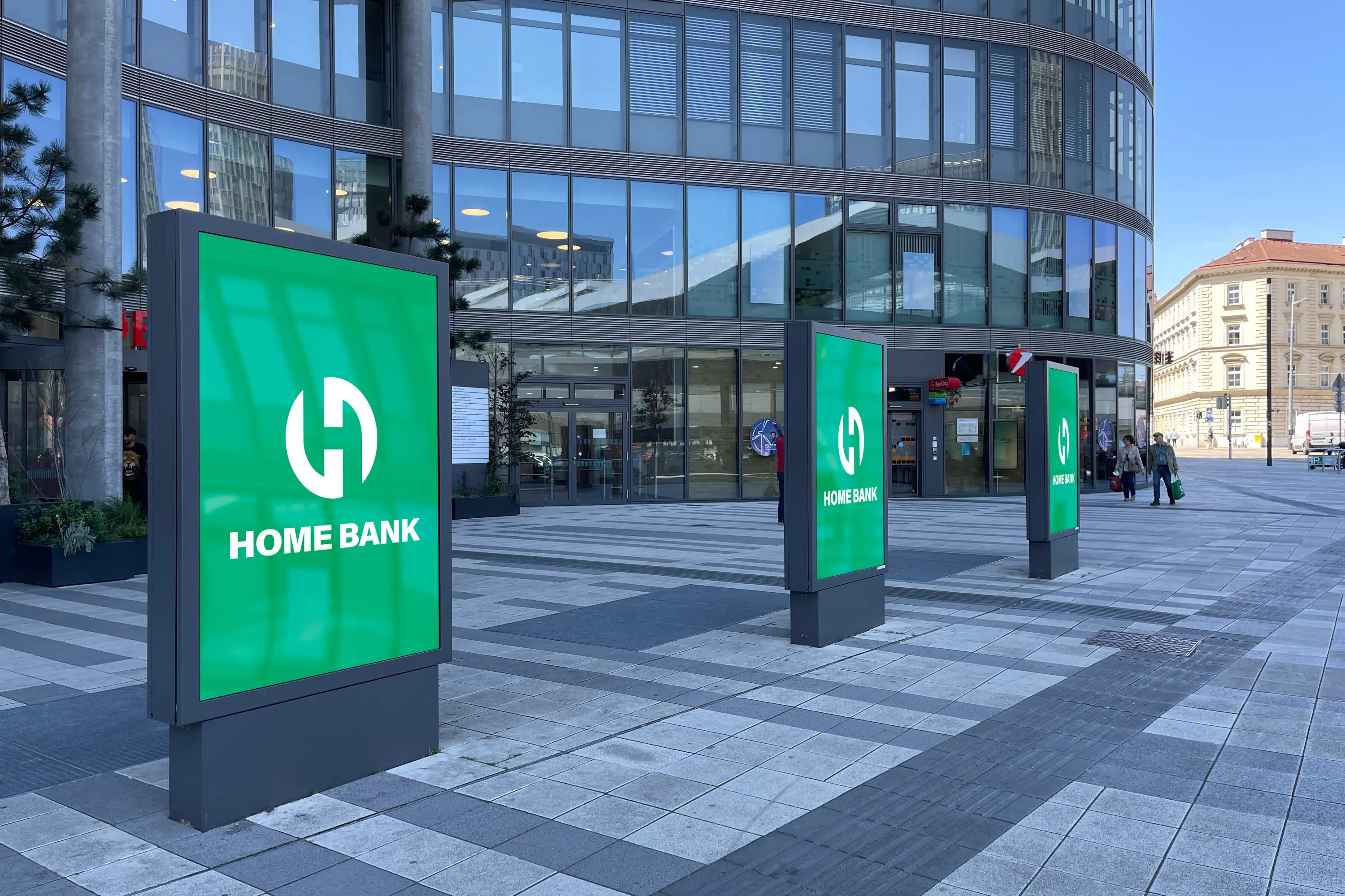
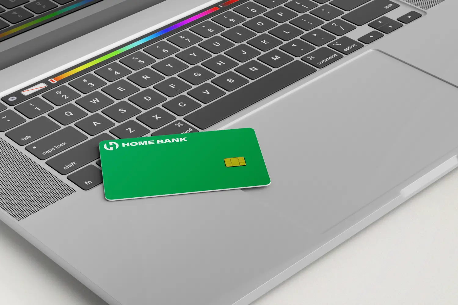
Preparation of final files: We have prepared all the necessary logo files in various formats and resolutions for use in print and digital environments.

03. VIDEO PRESENTATION

Order Now!
Let's start!
WRITE NOW
You can also write